In 2022, the Association of Hungarian Architects (MÉSZ) launched a student logo competition for the visual representation of the 120th-anniversary slogan of the institution - "Architecture all year round, MÉSZ 120 all year round". In addition to the slogan, I decided to redesign the identity of the institution. My work was awarded second place in the competition.
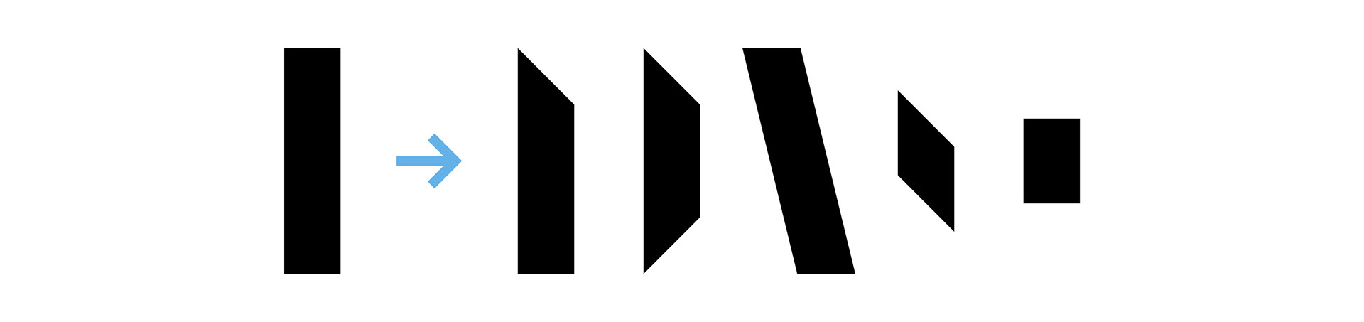
The Association of Hungarian Architects is an institution with a long history and high prestige. When I started the design process, I felt that the current logo did not fully reflect this importance, so I redesigned it as a first step. My intention was to design a clean, essentially geometric, elegant logotype that would reflect the timelessness of the architecture and at the same time link the institution to the present. The basic element of the design is the rectangle and its very simple geometric transformations. This, in addition to simplifying the usability of the graphics, gives the design a coherent, harmonious appearance.
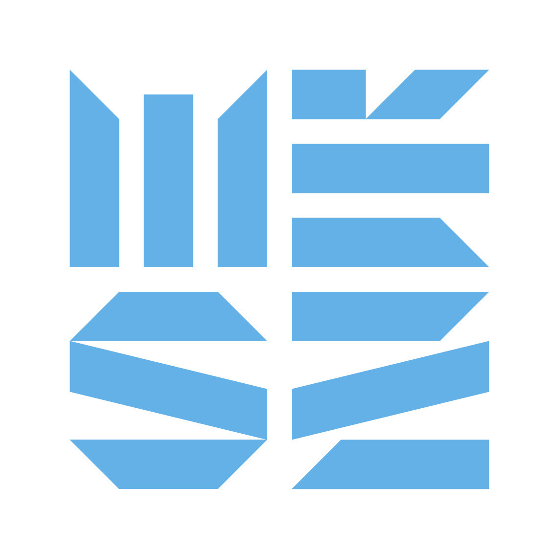
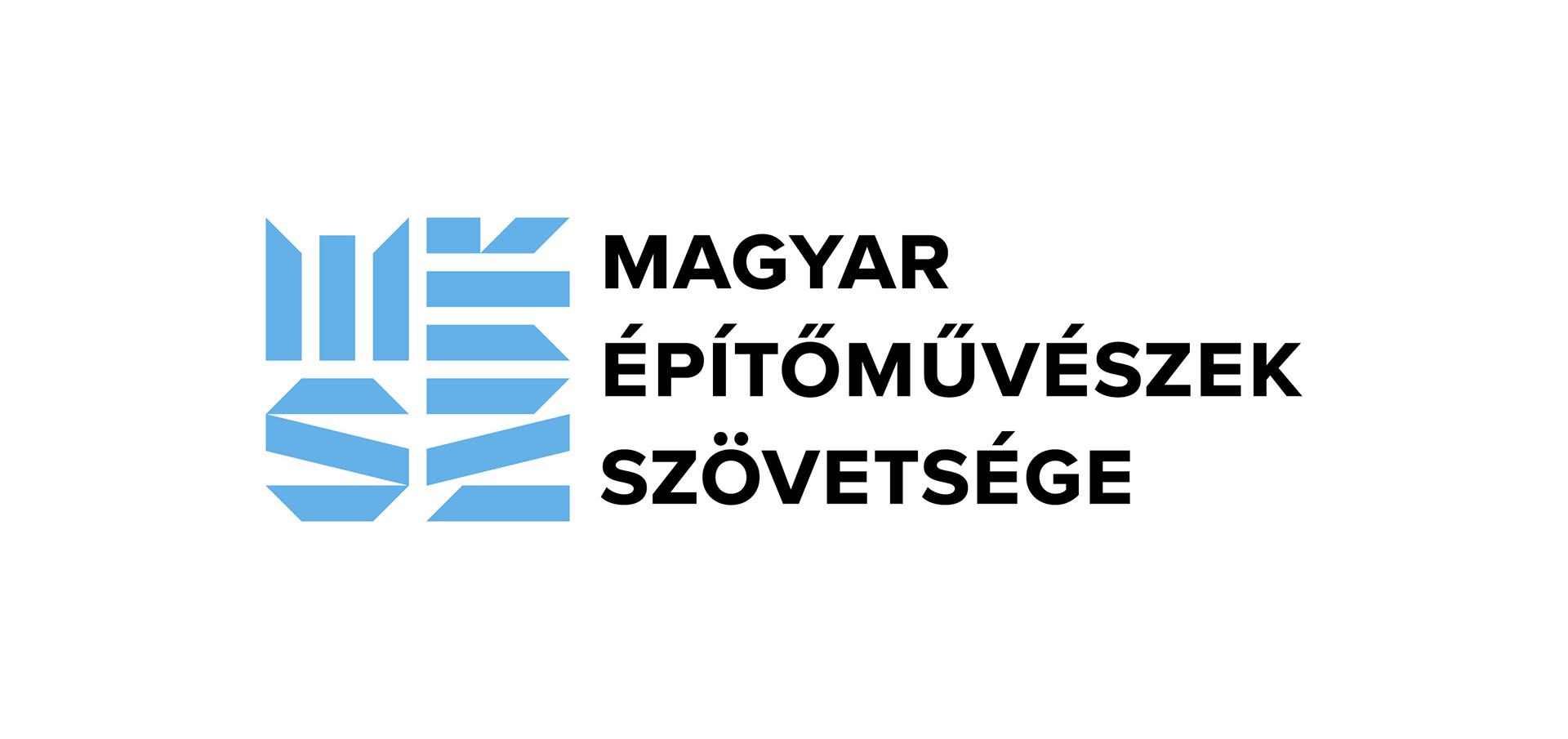
The logo is the result of the merging of the letters "MÉSZ", so it can be used as an emblem and also contains the name of the institution. In terms of proportions, the design takes the form of a regular square, further extending the possibilities of use: it can be used in both horizontal and vertical contexts. The pastel blue color chosen for the logo communicates a contemporary, fresh, and youthful feel.
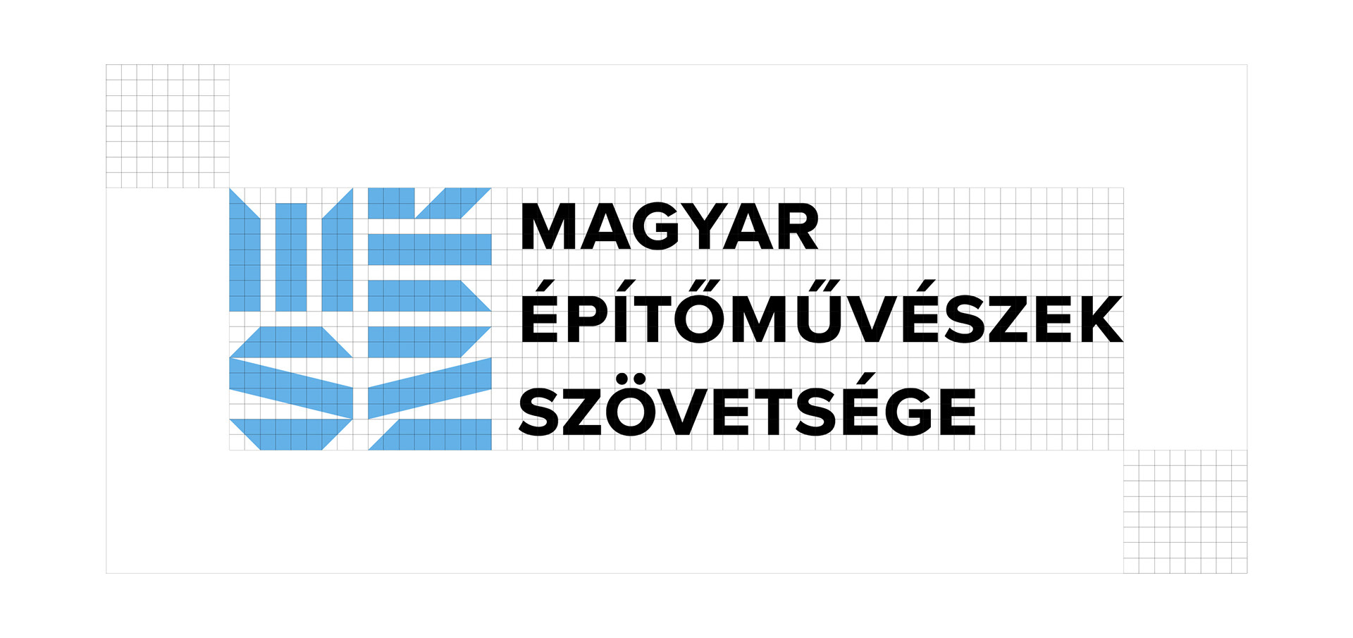
I designed the logo using a strict square grid system.
For the logo, I chose a new classic, Proxima Nova Bold, which has the modernist feel of Helvetica in its simplicity, but is much more versatile - it works well in small and large sizes, online and offline. The small capitals help readability and fit the geometry of the emblem.
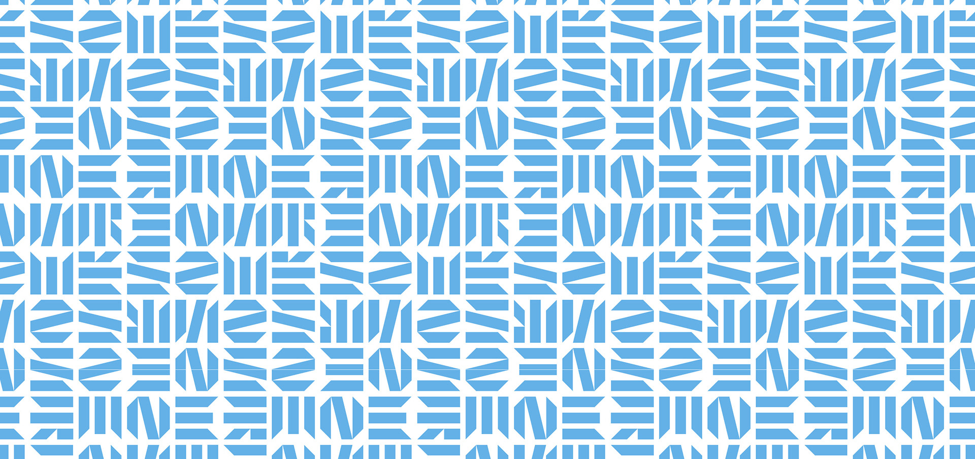
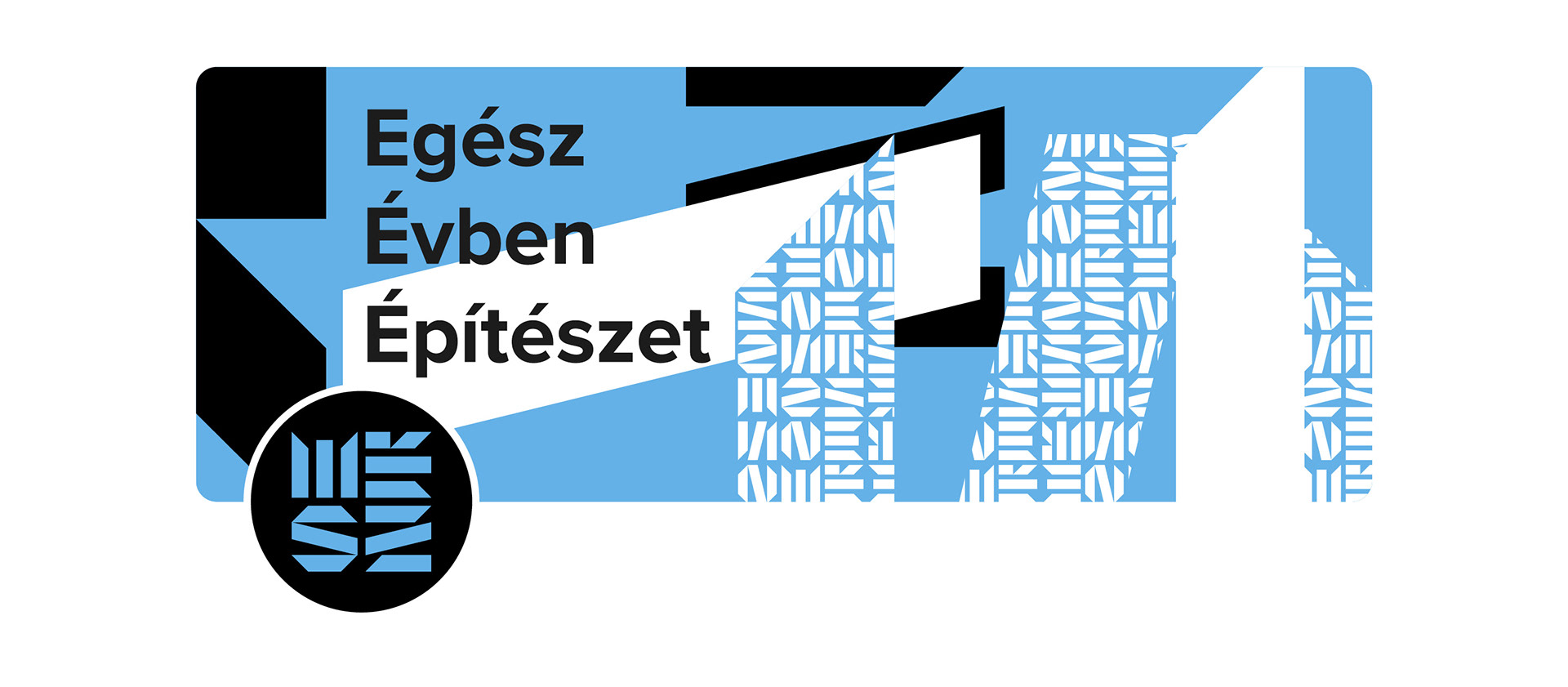
By rotating and mirroring the logo, a pattern can be created for a variety of uses.
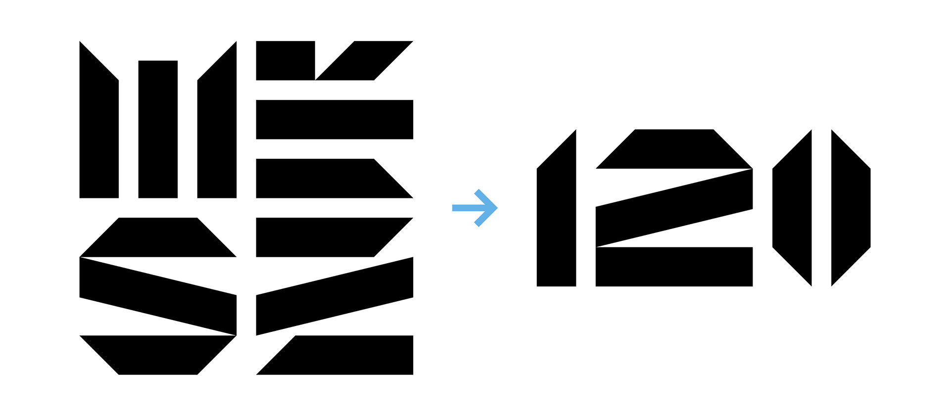
For the anniversary logo, I combined elements from the logo to create the numbers.
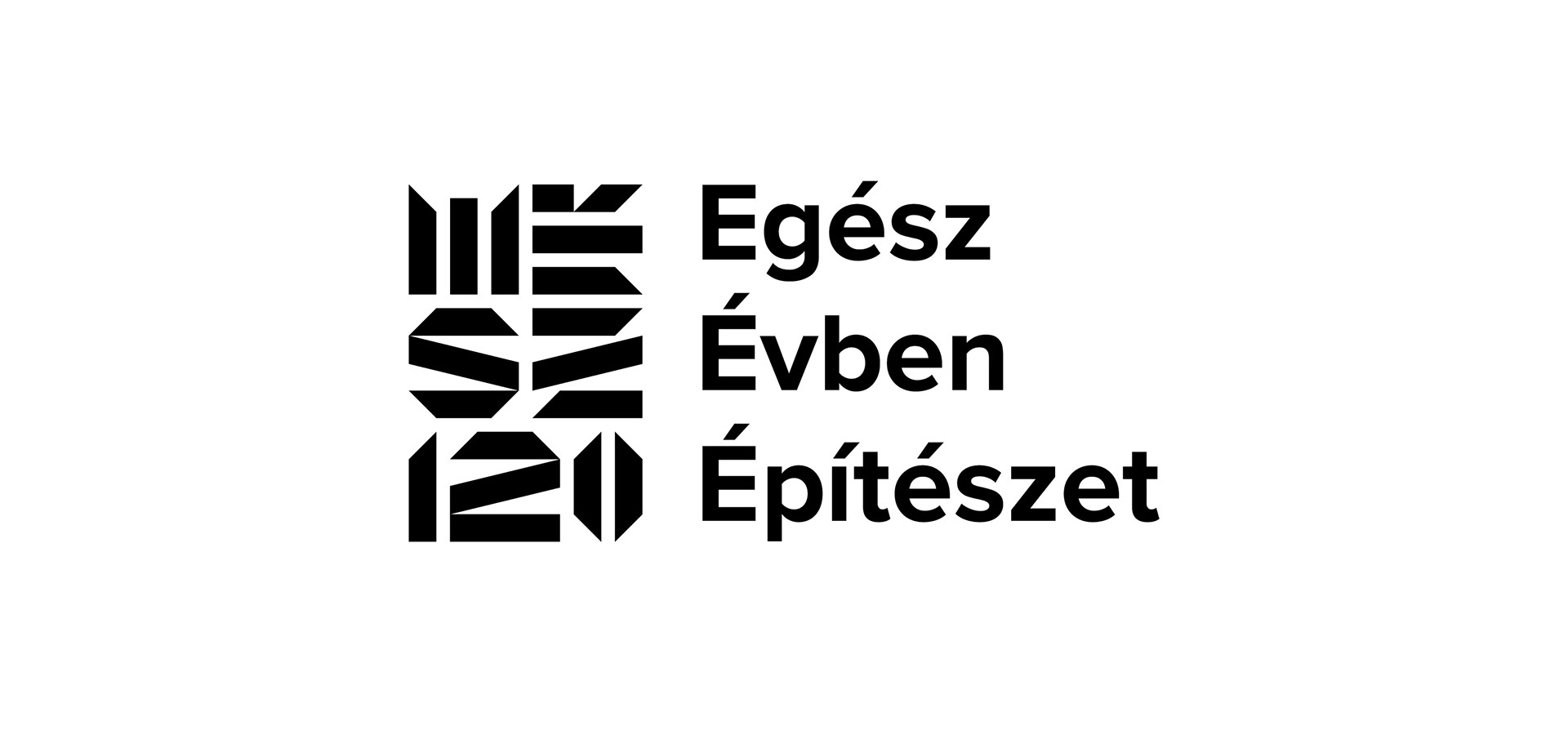
For the anniversary logo, I have left off the full name of the institution, as the new logo includes an abbreviation of its name. This allowed for clean typography.
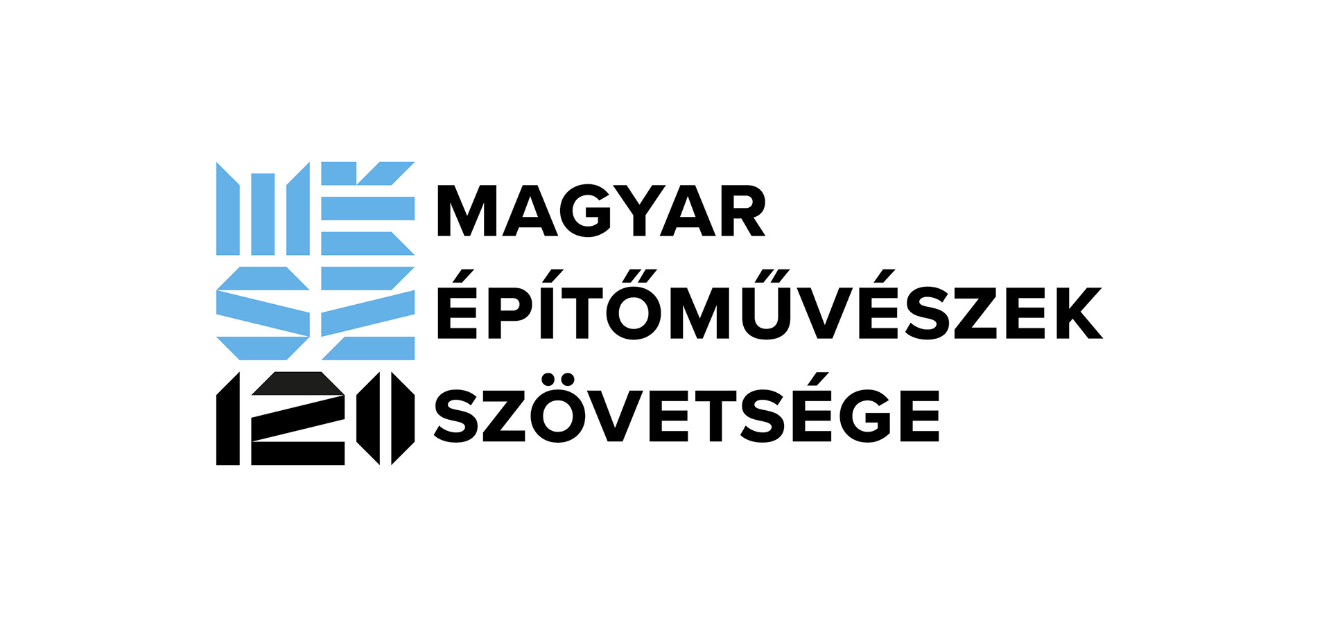
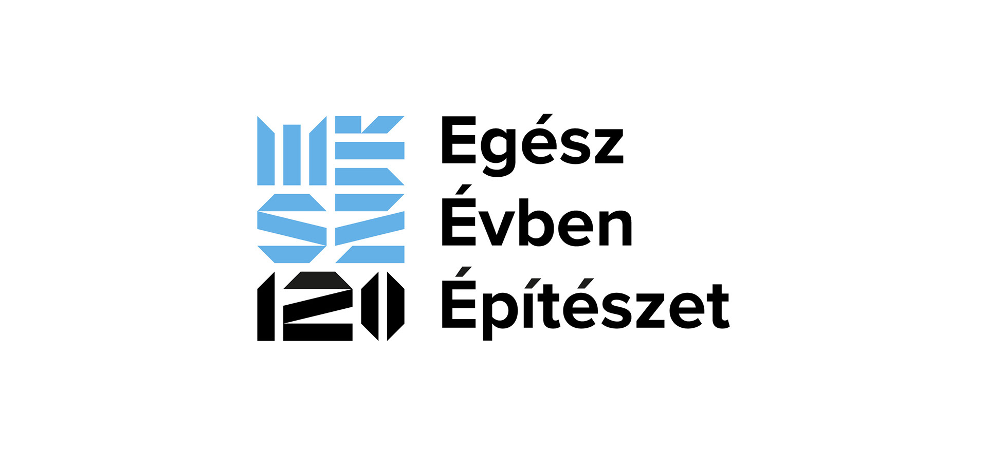
The anniversary logo, with the full name of the organisation.
It can also be used on social media platforms.
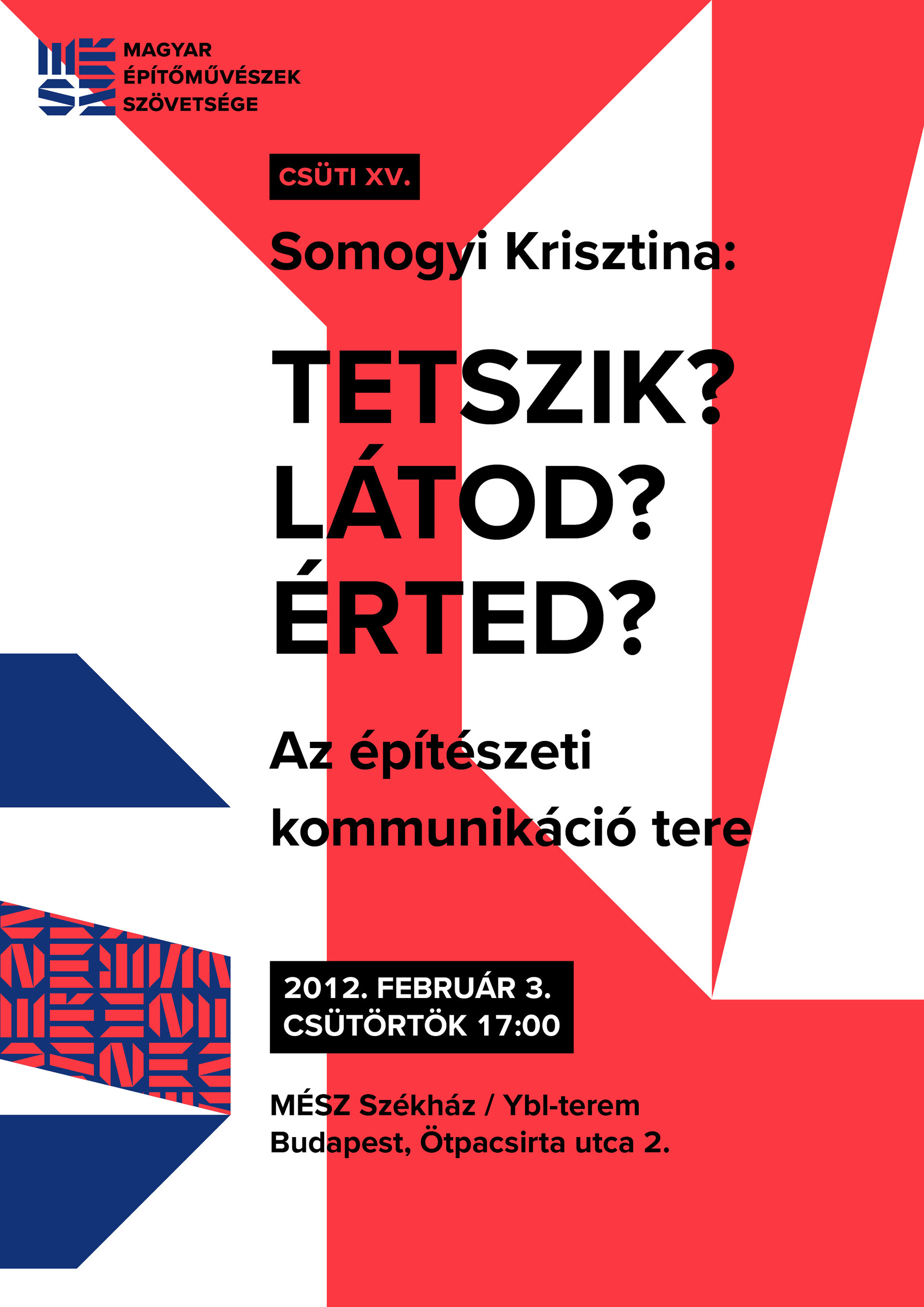
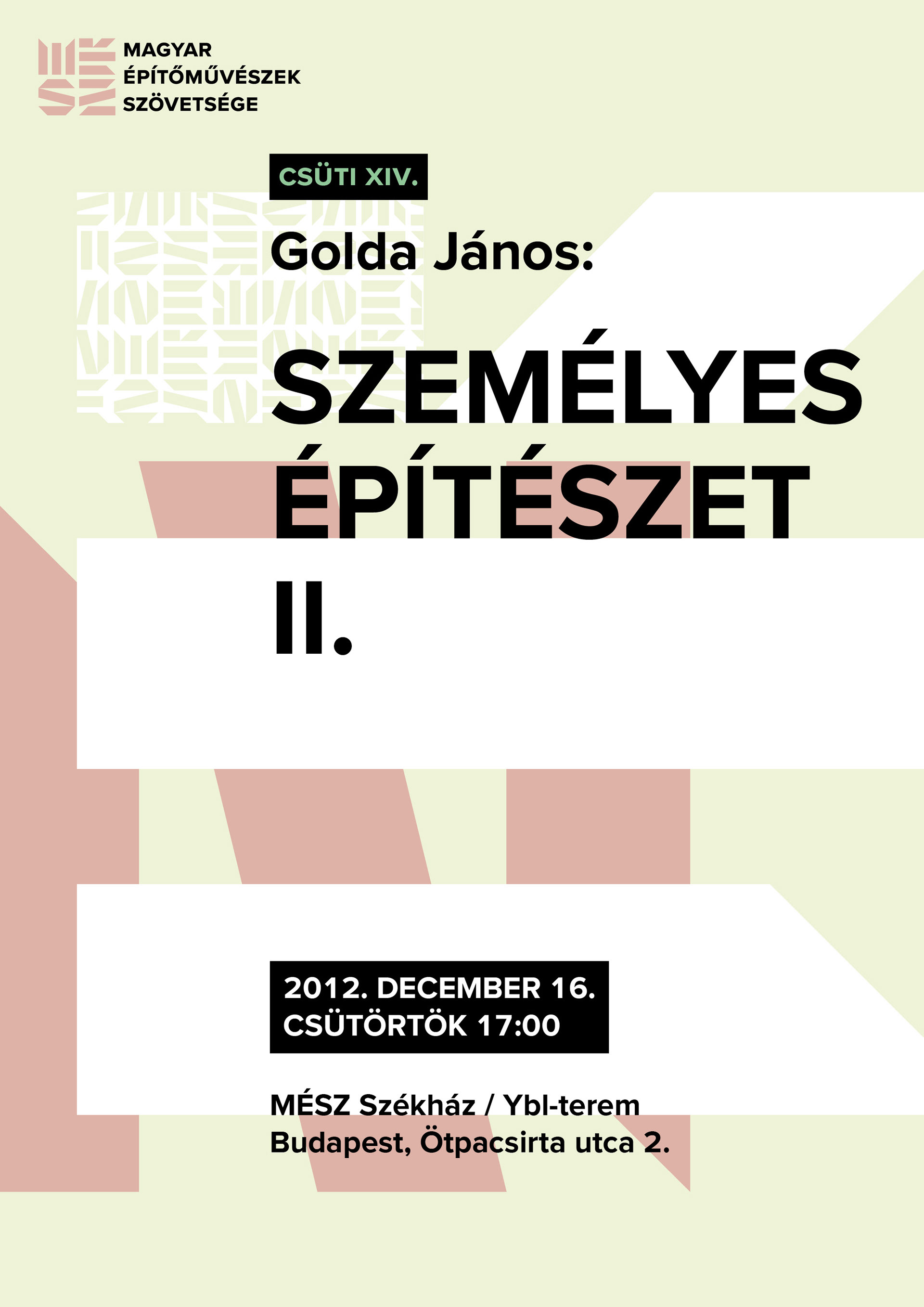
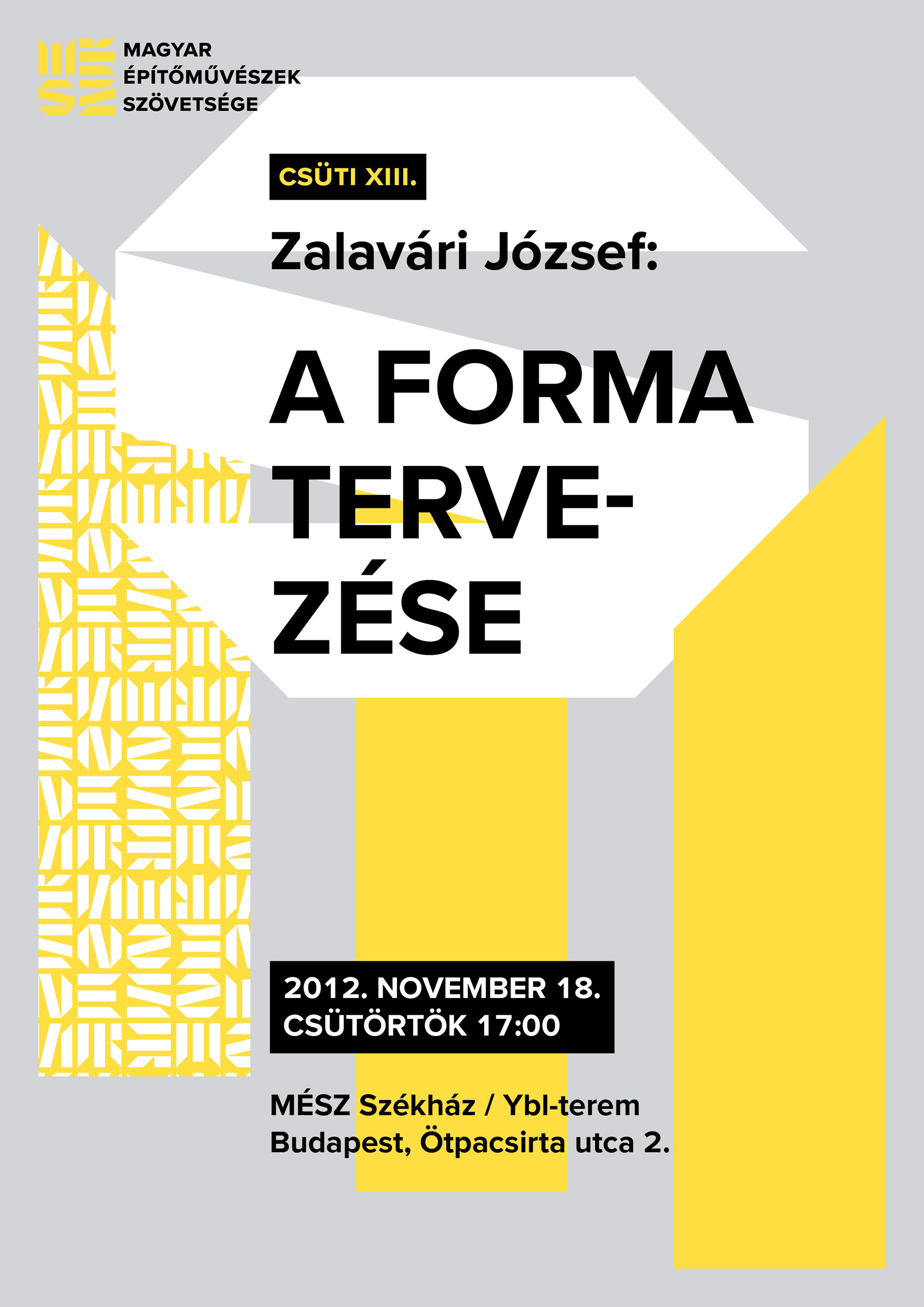
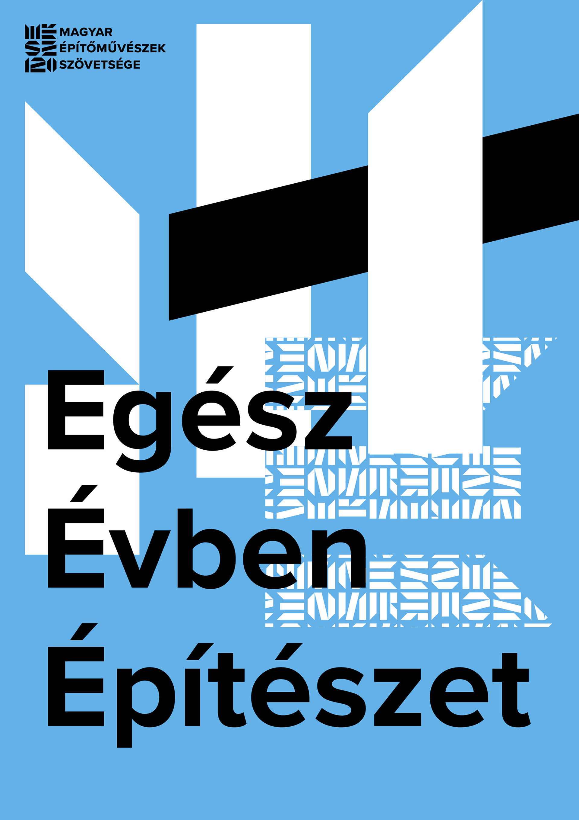
By combining the elements of the pattern and the logo, you can design a virtually infinite number of posters to give a coherent overall image of your organization's events. By eliminating the photo, the promotion of each event is greatly simplified, as there is no need to wait for poor-quality or late-arriving photos.
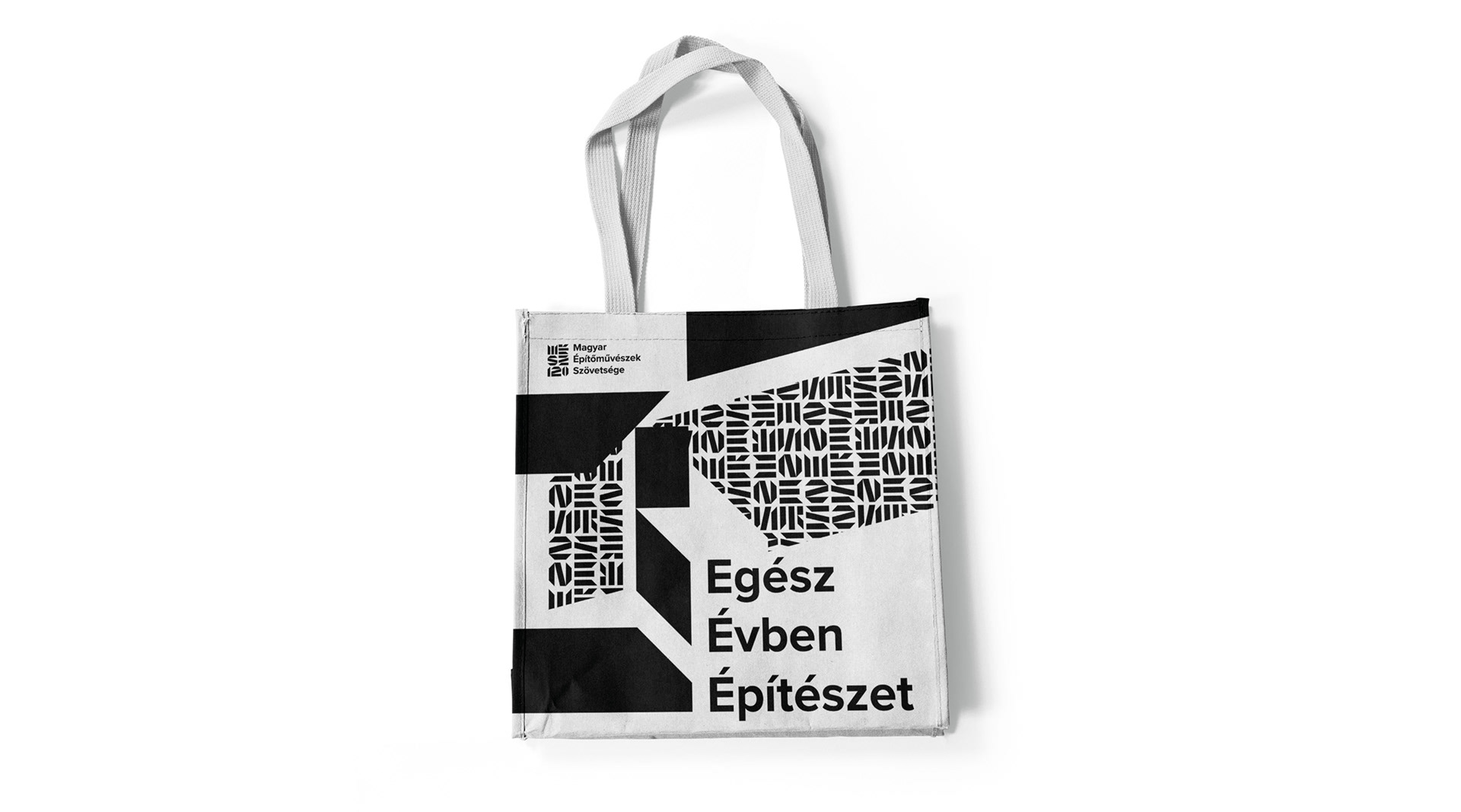
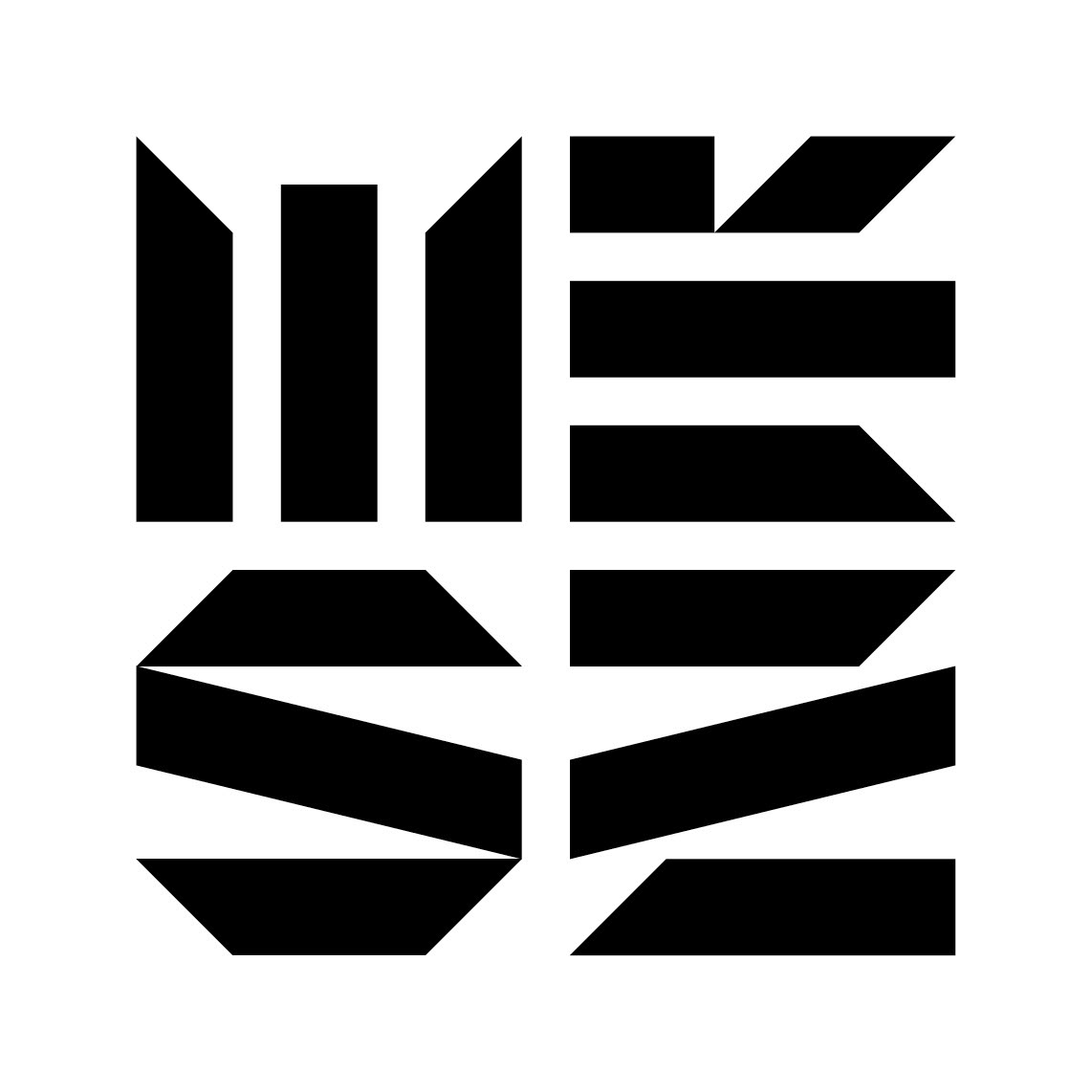
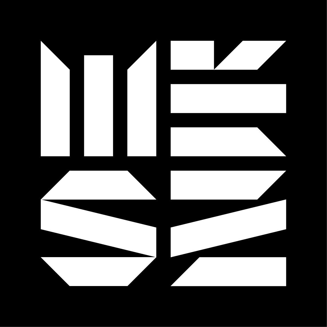
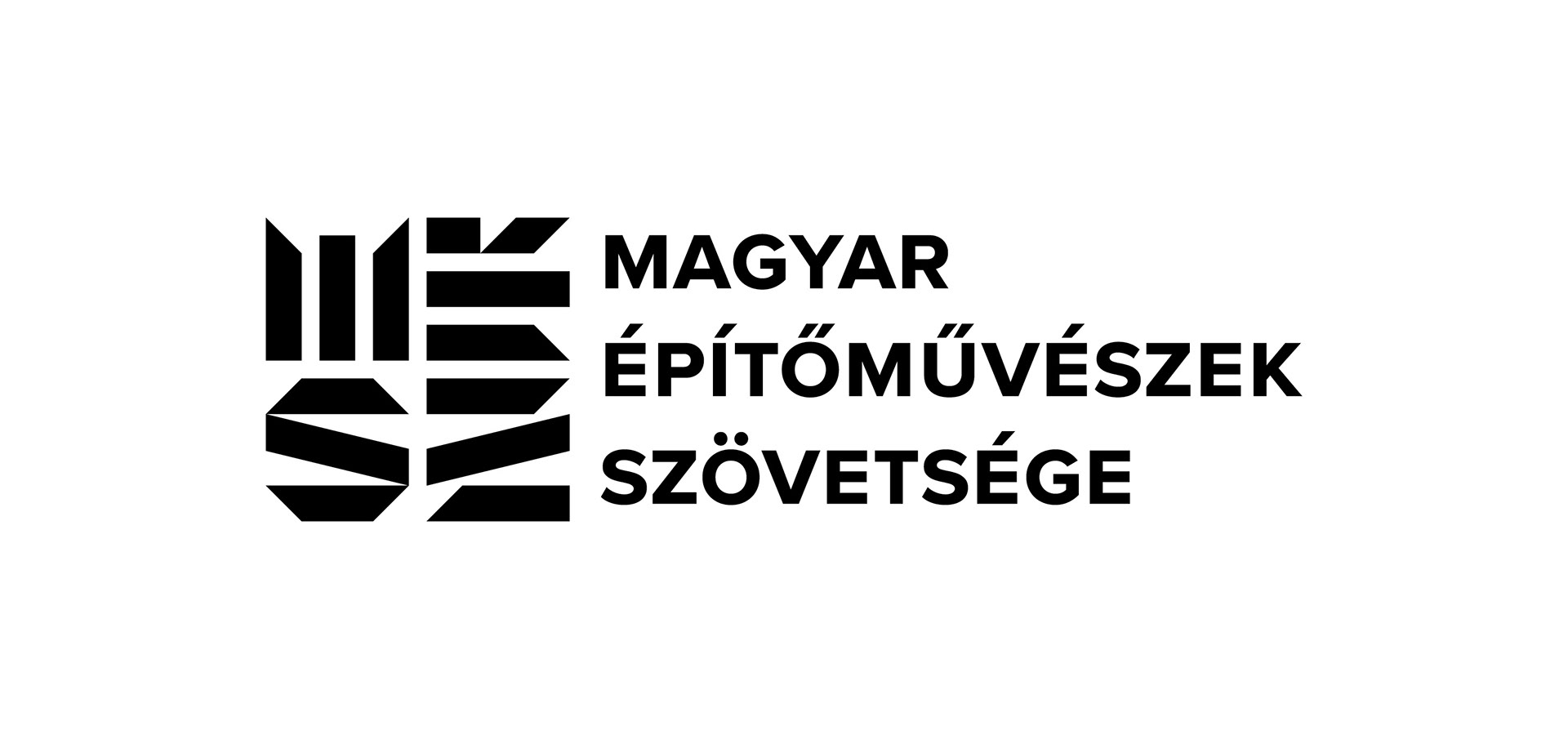
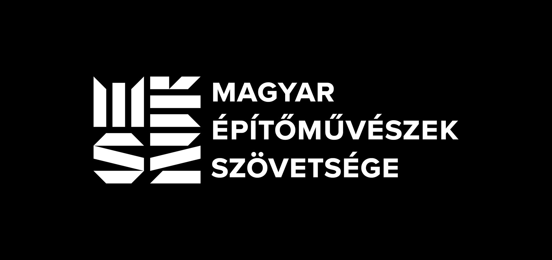
The design can be used on monochrome surfaces and can be produced using virtually any technique.