The new logo of Kőhegybor is ready! This is the winery in Szentendre that resurrected the town's winemaking tradition again – they make excellent wines. I've worked with them for a long time, I designed their label and now their logo!
You can check the labels here: https://krizbo.com/kohegybor-cimkek
You can check the labels here: https://krizbo.com/kohegybor-cimkek
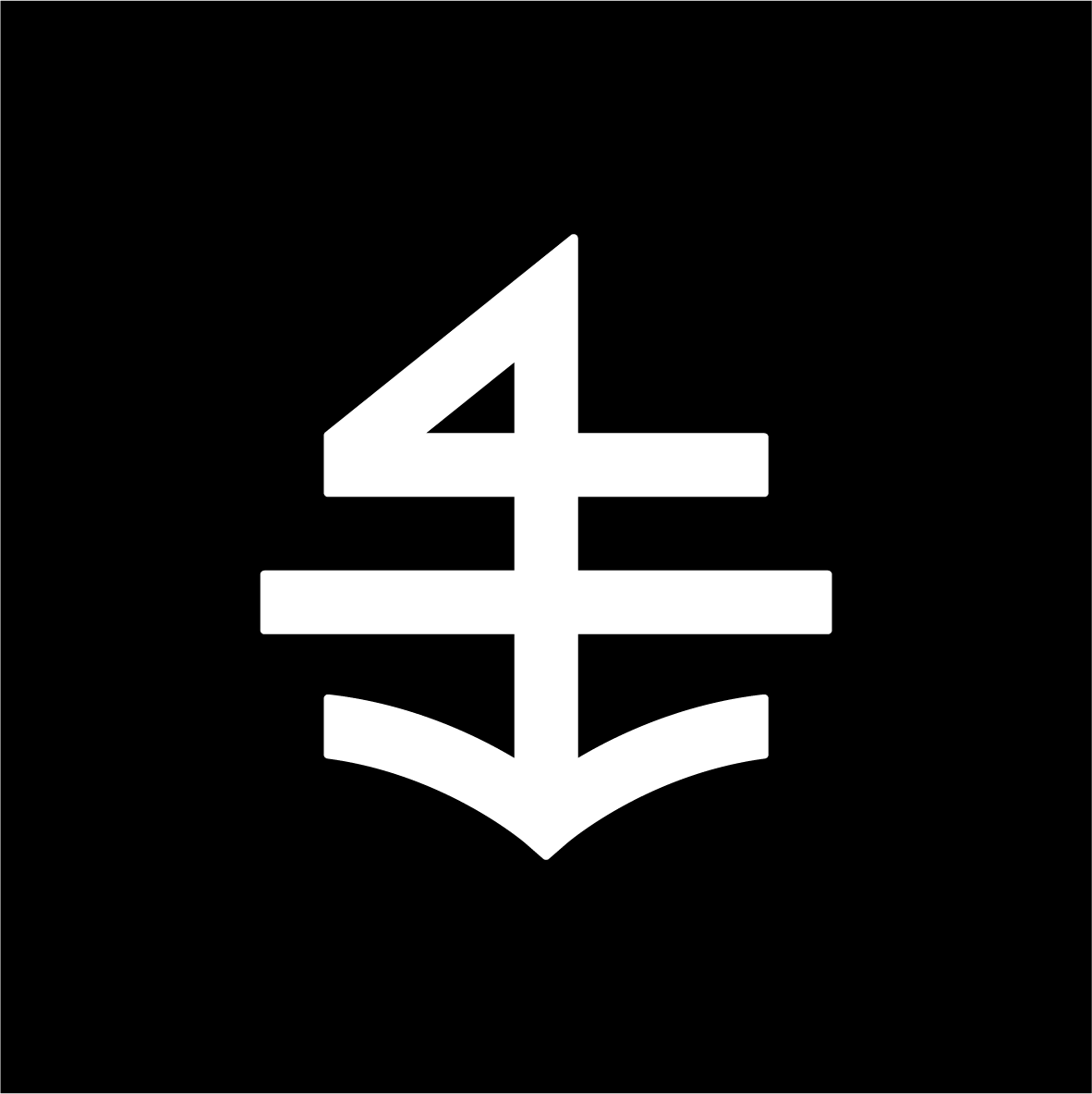
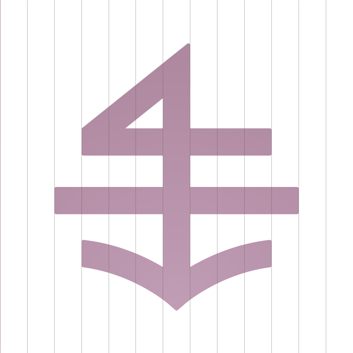
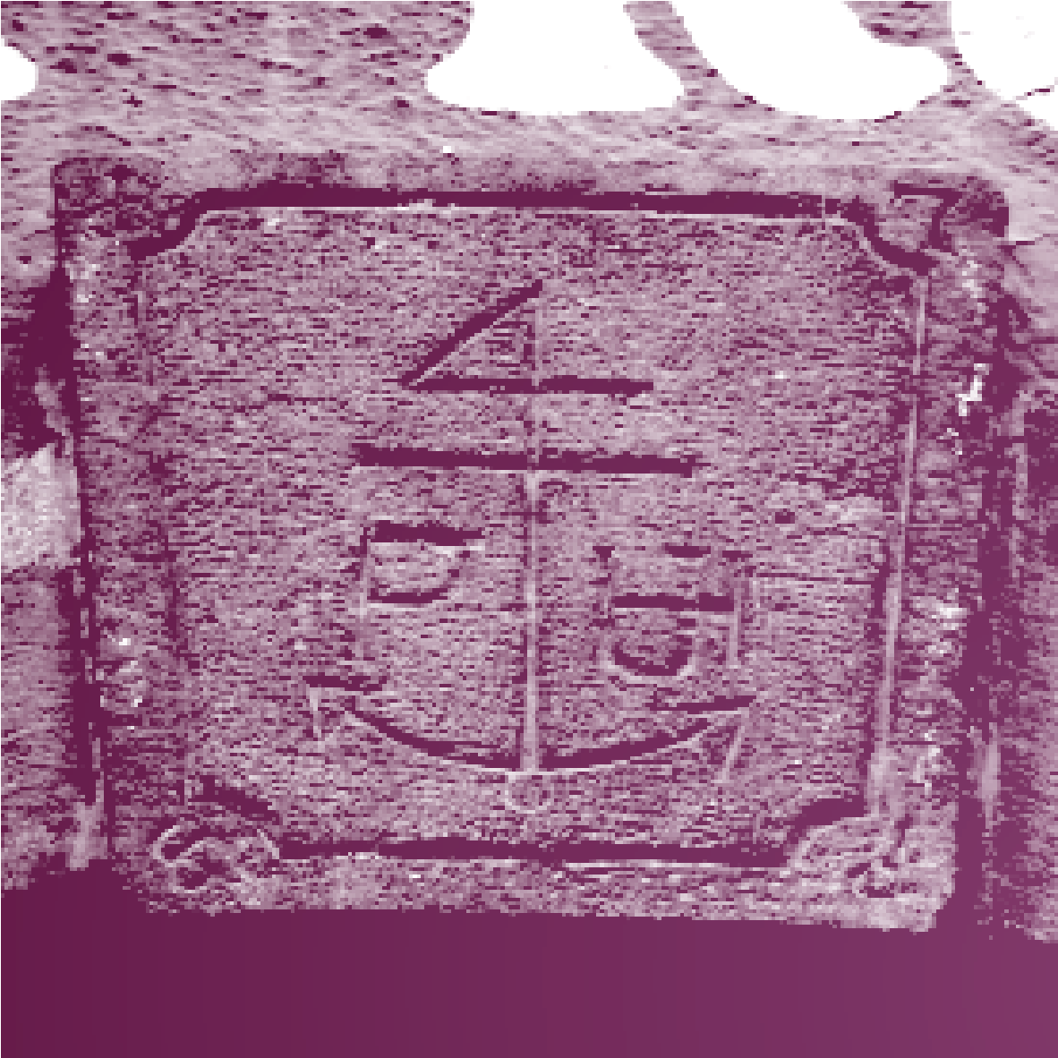
The logo is based on the coat of arms of the Serbian Privileged Szentendre Merchant Company. The anchor on the logo is explained to be a reference to the fact that the owner, a wholesaler, used to transport his goods by boat on the Danube. The double cross indicates that the family is a member of the Serbian Orthodox Church, and the number four indicates that the merchant has 'set in stone' that he will keep to the respectable 4% profit margin. A lesser-known but more likely explanation is that the coat of arms contains somewhat modified sacral symbols. So the number 'four' is actually Alpha, the beginning, the life, and the 'anchor' and the unclosed circle are symbols of Omega, the end, the death.